

It is essential for newspapers to work on building an effective layout to capture readers’ attention. In a competitive publishing environment, an engaging and well-designed newspaper is key for capturing the attention of readers.
A well-designed newspaper can draw readers in and encourage them to explore its contents further. With that in mind, below are some tips for designing a newspaper that will capture readers’ interest and keep them coming back for more.
1. Creating an Eye-Catching Layout
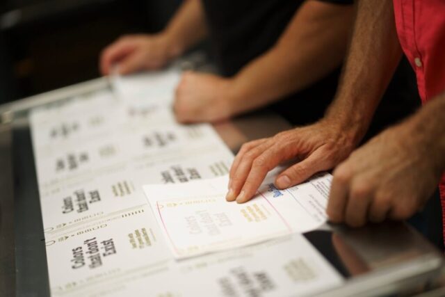
A key aspect of creating a successful newspaper template is designing an engaging layout. It should be visually appealing, provide clear navigation, draw readers in, and keep them reading.
Start by selecting a few headlines that you want readers to pay attention to and set them prominently on the page. Implementing white space between boxes or pictures, as well as reducing crowding, can help achieve balance in your design to make the page easier to read and process quickly. Another great option is to add photos that will capture attention right away.
Add interesting typography features such as strategically placed font size changes or different fonts for certain sections of text. Highlighting areas with defined shapes such as rectangles or boxes, which you can fill with color schemes and custom illustrations like icons, will draw further reader attention. Placing properly sized images within texts can also adorn the design nicely and make it more attractive; however, it’s important not to go overboard with fancy fonts that are too distracting or difficult for readers to parse quickly.
Overall attention should be paid towards maintaining simplicity for your layout so that readers are better able to retain the content in news stories without confusion or distraction from cluttered visuals. Even though there are many different ways for setting up a newspaper design, creating something eye-catching yet simple is often the best approach when attempting to engage readers with printed media content.
2. Choosing the Right Fonts
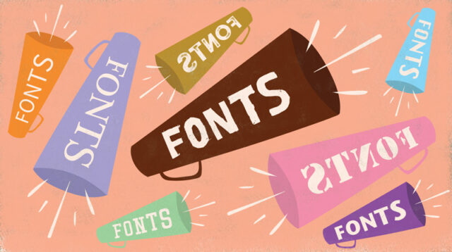
Many books on typography discuss font selection in detail, but there are a few basic guidelines that can help you capture readers’ attention.
Be sure to select easy-to-read fonts, such as sans serif typefaces like Arial and Helvetica. These fonts are designed for legibility at small sizes and have an uncluttered look that’s easier to scan quickly.
Avoid gimmicky fonts in favor of those with a timeless feel. While frilly or highly decorative typefaces may seem fun or trendy at first glance, they tend to distract from the content rather than draw attention to it. If you want a distinctive look for certain stories or article series, consider using only two or three different font styles throughout your newspaper instead of relying too heavily on multiple variations of elaborate typefaces.
Avoid mixing too many different kinds of font families together (e.g., for headlines) as this can create visual clutter and reduce readability. Selecting complementary-but-distinctive fonts from similar families will often provide greater variety without sacrificing clarity or creating an unbalanced design layout.
3. Using Visuals Effectively
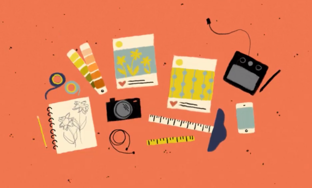
Graphics, photos, and other visuals are critical components for a modern newspaper, as they break up long blocks of text and can improve comprehension of difficult concepts. However, it is important to use visual elements thoughtfully and judiciously in order to avoid overwhelming or distracting the reader.
When incorporating graphics into the newspaper design, think beyond graphs and photos. Besides captivating images and diagrams, use typography strategically — bold fonts to emphasize key facts or headlines — as well as color boxes or lines to signpost these highlights. Decorative fonts can also be used sparingly (in headlines) for more impact and interest.
A few more points to consider:
- Strive for simplicity: a visual should be easy to understand without requiring further explanation within the article.
- Use appropriate visuals: if your audience is made up mostly of business professionals, charts may be more useful than cartoons!
- When using maps or diagrams in articles about abstract concepts such as crime rates per city rather than physical features like lakes or mountains, use drawings or graphics instead of actual topographic maps.
4. Incorporating Color

Color significantly impacts how readers perceive your work; it has the power to direct attention, influence emotions, enhance meaning, indicate changes in text features, and even reflect branding. With so much on the line, carefully choosing colors when designing your newspaper can be an intimidating process. However, by following some key tips you can ensure successful results:
-Choose colors that will draw attention – Use three or four dominant colors judiciously that help to create drama. Bold hues grab attention but should be utilized sparingly as too many bright colors could make your layout visually unappealing and difficult to read.
-Stay consistent with color themes – Create emphasis by selecting one pallet (triad/split complement) anchored around one key color – such as red or blue – while utilizing one or two accent colors depending on what looks best visually with the images being used. Avoid uncontrolled splashes of random accent hues as this will decrease consistent branding throughout the design.
-Keep it classic – Stick with typographic standards such as black and white for headlines and dark grey fonts for body text– both are seen more often in print than on other digital media platforms such as websites. When using vivid colors for accents like tables or pull quotes only employ them in small amounts lest they come off as garish and detract from readability rather than enhance it.
5. Proofreading and Editing

This step is crucial in making sure any mistakes in grammar, punctuation, style, and context can be corrected before publication. When proofreading and editing articles for your newspaper, keep these few tips in mind:
- Read through all articles once for structure: Determine if each article includes a clear beginning, middle, and end that follows a logical structure.
- Check for grammar: Pay close attention to grammar, punctuation, and spelling mistakes that may have been missed during the first read-through.
- Look out for typos: Run a quick spellchecker on each article to look out for any typos or words written incorrectly due to typing errors or incorrect spelling.
- Monitor consistency: Be sure that every article follows the same standard of formatting and style guidelines – this will ensure that your newspaper has an overall sense of unity.
- Double-check facts: If necessary, verify any dates, quotations, or statistics cited in articles are accurate – this could involve double-checking sources once more as incorrect information can damage a paper’s credibility with readers.
Conclusion
Designing a newspaper is an important task and it’s essential to make sure you consider how to capture readers’ attention. With these tips in mind, get creative with your newspaper designs so they stand out among the crowd – good luck!


